Task EIGHT
What are my opinions on sustainable design?
Its purely simple. Starting from something small and turning out to be big. A few power words on a carrier bag could play a role, that's why supermarkets and other places are charging for carrier bags because people do not know what to do with them after there shopping, with me i use it for my bins around the house, but like Alan Morgan (Senior curator for science museum) says imagine the fcuk carrier bags with the slogan "Don't fcuk with the climate" that are out in the market, like for example the plastic bottles get thrown after would become a powerful promoting sustainability. A very clever idea indeed. Personally designers could help aware audiences in sustainability by placing powerful and cheesy words in our everyday useful activities cup/mugs, posters and billboard. What do Britain love....... a beer so maybe a design could be associated with the beer like placing awareness in pubs, clubs and football ground. Something that will catch audiences attention even so for a split second. Now BP are placing there adverts on billboard about sustainability but us designers could play a major part in promoting sustainably after all we are the most creative bunch out of all so why not send it out to the public by all methods. Us designers have to think about the recycle side to the productsare the main prime example. Plasticits been use it a WASTE, everyone does it and there must be a limit, on how we could we recycle the product and use it for something else. These are the things we need to think about.
Knowing more and more typefaces
1. I could tell many typefaces by just looking at it or even know which group of family they are related to. i.e you got the Arials, Myriads and Helvetica that look-alike, you got the Garamonds and Bondoni that look-a-like and even so Bookman old style looks like the default typeface Times new Roman. So watching the film Helvectica has helped me and improve my strength in typography. It has also made me realise that we as designer see type as an image rather than just the letters and words.
A true inspiration
2. Watching the Zaha Hadid documentary was the most passionate video of all of the videos i watch during the class. Why? because it shows the courage she had inside her to become the most successful female architecture of the 21st century. The amount of times she got push back and fourth was unbelievable and still she wouldn't taken No for an answer, her rejection was bouncing back stronger, so she carried on and on till she got her moment of truth (her architectural building work) Most of all she wasn't even from U.K and her second language was English. Us designers should defiantly see her as a role model. Certainly she is an inspiration to me, if i had relations to her i would importantly see her as a guidance for me and the probably of me becoming very successful would be high.
Onedotzerodotsimondotanimationdot. . . . .
3. I'm always fund of moving image work, studying part of the degree was to do with moving image. For me i always look into the future and would love to do a advert which is computer generated digital media i.e matrix robotic style (car adverts are in those sectors). So i would want to defiantly be part of it and show public what i am capable off. OneDotzero 's work are corporate based commercial, In particular the striking commercial was the Illustrated animation rapping to DMX lyrics. Very good and also the guy sleeping with other guys. A long illustrated animation was involved. Whilst i was watching the commercial i was also thinking the technical side to it. Hmmmm..... i wonder how long it took them? defiantly time consuming.
Simon and Me, Designers and me
4. Before I watched the Roger and me film directed by Michael Myers i wasn't to sure who he was or what he has done until now. The kind of person he is, is very annoying to majority of the public, either you hate him or love him and for some you may not know who he is, but the main point is what he does. You could say he has some resemblance to the designers task. I have learnt that you have to hassle your way and try to sell yourself to client and not be shy to talk. As they say make sure you get your foot in the door.
Tutors advice
5. During the first semester i went to interview people to help me with my research like the campaign against bicycle theft. If it hasn't been the discussion with the tutors i wouldn't get the appropriate research i wanted to complete my project. So big thanks to them that they encourage me to go and speak to them in person.
My crew
6.Forming a group discussion was very handy for me, getting feed backs from others were very critical without them i wouldn't have done it on my own. So that's why i want to join a design company rather then be a freelancer. sharing ideas and giving out ideas are all beneficial so that's why i need them and hopeful they need me too, to make our work and projects become clearer to the audiences.
shynesssSSSSS......
7. At the start i kind of got shy of talking in front of a class of 10 students. especially if they are 90% are women, but eventually as i got to know them all individually i became more confident and spoke about my work and social life with them. So technically they are my friends as well as they are students. Also its good to see not all of them are from U.K many are from a different culture, background and diversity so picking up ideas and information does improve my knowledge.
Design project B
8. The current project i am working on, which is design project B has taught me all sorts of hand crafted skills. All of the below are the fazed i went through and i may experience similar project in the near future.
- Working the mechanism of the pop up for my book.
- Allowing plenty of time to bind my book
- Using the layout grids for my photograph and text on the double page spread.
- Making the cover.
Sustainable awareness
9. After watching the sustainable project it does become very depressing, (like Natalia said last week). In the past i have done sustainable project in my degree year and also went to the science museum to do a project upon it, but not in depth about sustainable, so after watching the 11th hour it has made me realise on how designers could get our message across to the audience that are not so keen and aware of global warming and the natural hazards that are occurring in our society. I want to be part of that design group that work with on going sustainable projects because, people shouldn't do the unnecessary habits like, leaving the room lights on whilst no ones in the room or even change from baths to frequent showers. If everyone do there part then I'm sure we will get into the good habits and improve our society and the atmosphere of the earth. Let the generation go on and on and on with the effects of the natural hazards.
10. Experimenting with all kinds of equipment The Sewing!
When Amanda says bring the sewing equipment by next week. i picture in my head what? a sewing machine hhmmmm...... but then she explained it more details and says we are going to sew. Damn it! i know I'm going be the rubbish one for that week especially being a class full of girls. So i kept on reminding myself the best tailors out there are the men and hopefully I'm one of them. When i was sewing it took me ages to do one letter, let alone one word. The room was quiet everyone is happily sewing and completing there task but with meeeeeeeeee.......... NOWAY! struggling but eventually i did the whole one but then cheated the rest by dotting with a colour pencil the rest of the words to make it look like i have done a lot. sorry guys!
posted by Simon Genesis @ 16:13,
,
![]()
Task SEVEN
I believe Graphics needs advertising and vice versa, without the both they will not be completed. I have also spoken about packaging (task 6 in my previous post) which certainly plays a big role in advertising. The role of advertising needs to communicate with the audiences and try to think or even persuade consumers into pus chasing the product brand or its services. In order for the advertisement to be effective it must send out the message it wants to relay. i.e the advertisement is trying to sell a particular product than it must persuade the audience that for whatever the functional or emotional reason they need to purchase the product.
Although the message needs to communicate with the audience effective, the individual audiences must be willing to buy into the desired message. The message needs to be sent and received in order to know this particular advertisement has been mission completed. As advertisers says
Advertising is a 2 way communication process!
In my opinion a good advertising needs to be soooooooooooooooo different from the rest. It needs to be unique and hasn't been done before neither should it be plagiarised for example. audiences will recognise an advert posters billboard etc if it has been done before so advertising needs to be new and hasn't been heard or seen before.
I also believe advertising needs the following:
Typeface : audience needs to see a clear typefaces as an image in advertising so make the typeface to be equally as important as the image.
Colour : The colour needs to be different to your target audiences. i.e if you want to brand a new chocolate you wouldn't want to use red and black because red and black is used for Mars bars.
Image : The image needs to be clear so the audiences will know what is it about, without having to read the type next to it.
Space : is an important role because audiences needs to rest near eyes on that particular part of the advertising, you wouldn't want to crowd everything altogether so it becomes so visually busy, This will put off audiences
Slogan : every company needs it slogan and funny enough in my opinion the more funny it is the more distinctive and recognise the company or advertising it is. Also when u say the companies slogan, it needs to have a rhythm when speeching it out. A few example below which are verbally memorable
"I cannot believe its not butter."
"Bam Bam BamBamm Bammmmmm Im lovin it"
"You've been Tango"
"You can do it when you B&Q it"
"Call 118 118"
Its not just any pudding its M&S pudding"
Good Ads
I like adverts which are motivating, which will give me insipration and often gooesbumps. This is why i chose nike ads to be one of them.
Stickman plays footie with a world class star


Rubbish ad annoying as well
Made from perfectionist Peugeot 407

(everyone knows peugeot is not known for the greatest cars)
Clever ads abroad very funny


Below is the Jordan "failure" of the ads i got in my bedroom wall as it keeps me motivated and inspired by. I love this add so much..........

posted by Simon Genesis @ 17:51,
,
![]()
Task SIX
Packaging
The use of packaging is:
Security, packaging is an important role of reducing the security risks of shipment. Packages can be made with improved tamper Resistance to deter tampering and also can have tamper evident features to help indicate tampering. For example cans of soft drinks is a prime example nearly all of the food shops uses a foreign drink i.e Poland Netherlands and other countries but by law in this country it has to have an English text on the individual cans
Physical Protection, from objects being damage or damaging other products i.e squash shock compression and even temperature.
Information Transmission, is the way finding of the objects weather how it will communicate with each other and its audiences and also weather if its recycle or disposable.
Marketing -The packaging and labels can be used by marketers to encourage and persuade there target audiences into purchasing the product. That's why designers has to play an important role in aiming to get the buyers attention. The unique selling point is the key of the product.
Packaging Design
Packaging design emerge in the 19th century as a new technologies enables manufacturers and growers to supply there products to stores in pre- package store formats.
Packaging labels play a big important role into the public, because buyers chooses there usual brand. As you can see from the two images below majority of the people say coke and Pepsi taste the same and a few people say they don't, so if i switch the labels around how many out of 10 people will know which brand is which?
I believe 9 out of 10 people could not tell the difference between the two but however Pepsi is competing with coke by lowering the cost of the product, registering there own colours(blue) just like coke( red) As you can see even the lids have its colours, but however Coca cola seems to be the popular brand and product in this country.


A good packaging designer needs to think about the consumers will look at a product for less than 3 seconds before deciding whether to look further or move on. So the designer must have the the following purposes below
- a means of protecting the contents of a package
- The cost of the finishing package
- a good use of colours, type and image to the design on which to promote the product's attributes and benefits
- a part of the product experience itself
www.designcouncil.org.uk says
Look at me!
Another key factor in aiding standout is having recognisable, simple icons - things that stand out even without looking directly at them. These icons can be called 'visual equities'. There are a number of tools you can use to create visual equity and thereby improve standout:
- Shape: e.g. the Perrier bottle (designed to echo a droplet of water), an iPod or a bottle of Chanel no. 5
- Colour: e.g. Levi's Red thread, Kodak yellow or the black and cream of Guinness
- Illustration: e.g. the Fox's glacier mints polar bear, the Nike Swoosh or the Kellogg's cockerel
- Name: e.g. 'I can't believe it's not butter'.
posted by Simon Genesis @ 08:12,
,
![]()
Task FIVE
Design Companies
Zerofee is an ethical design agency
We don’t like to lend our skills to brands and companies (or anyone / thing else, for that matter) who we feel has a negative impact on the world we live in – be it socially or environmentally. On that basis we don’t approach or accept work from potential clients that we know to be carrying out their activities irresponsibly – be it through blatant environmental disregard, the exploitation of people or a philosophy of ‘profit before welfare’.
Naturally, these can be difficult factors to uncover or determine, but we apply research and careful judgment when choosing who we work with. We’re determined not to assist or benefit from those who we believe to do harm.

The Ethical Graphic Design Company (previously Sussed Design) helps promote organisations who are working for positive change, whether it be through education, the arts, campaigns or by helping people or the environment.
We do this by providing highly creative, highly effective graphic design. From bold promotional material to clever identities, from simple websites to cutting-edge illustration.
Milton Glazer says
![]() The question is whether concern about the consequences of one’s work can become part of the ethos of [graphic designers'] field. We all say no to many things that violate our ethical standards, why should our professional work be an exception?
The question is whether concern about the consequences of one’s work can become part of the ethos of [graphic designers'] field. We all say no to many things that violate our ethical standards, why should our professional work be an exception?![]()

This piece of artwork says it all about the rights of not killing living animal, it is an illustrated and clear drawings of animals getting slaughtered for the public like us to feed on.The first image where it has shown a chicken being stripped naked has got this pain fullness feeling towards it, whilst the second image of the milk carton shows the type MILK being dripping of with blood. No living object wants to be squeezed out of them, its like saying humans are compulsory to get them self tested with all sorts of new drugs, i.e Cows don't want farmers squeezing milk out of them whilst chicken don't want there eggs being taken away from them, likewise with sheep do u think they want there furs shaved of them?. All these edible animals will put up a good fight, but in this world its a dog eats dog and this is where the food chain comes into the scene from the primary consumers (herbivores) to the Quaternary consumers (carnivore).
They expect people to contact them as they will most likely reply to all of its readers
as quoted on their website
Graphic design plays an important role in society by marketing ideas, products and services. At The Ethical Graphic Design Company we believe in taking the moral high ground and only producing design for good.
Wherever possible we promise to:
| | Only provide graphic design for companies, organisations or individuals who work to benefit humans, animals or the environment. Never do business with an unethical or immoral organisation. Run our business as kindly to the environment as possible |
We also promise to be nice, friendly and honest to people. Get in to find out how nice we can be!
http://www.ethicalgraphicdesign.co.uk/
Design Business and Ethics
AIGA has published a series of brochures outlining the critical ethical and professional issues encountered by designers and their clients. The series, entitled "Design Business and Ethics," examines the key concerns a designer faces in maintaining a successful practice and speaks directly to the protection of individual rights.
Authored by industry leaders from across the country, each brochure offers clear and concise information, as well as practical and specific directions for approaching design issues.
Revised versions of all the brochures were published in May 2007, available here as PDFs. We encourage you to download and reformat the information as part of your regular proposals to clients (giving proper attribution to AIGA).
New topics in the "Design Business and Ethics" series will be published periodically to build a basic library for designers and their clients. The intent of this series is to develop content that is useful to designers, as well as being a resource to educate clients on standard practices and legal requirements faced by design firms.
http://www.aiga.org/content.cfm/design-business-and-ethics
posted by Simon Genesis @ 19:01,
,
![]()
Task FOUR
Corporate social responsibility (CSR)
Wikepedia says....
"Corporate Social Responsibility (CSR), also known as corporate responsibility, corporate citizenship, responsible business and corporate social opportunity[1]is a form of corporate self-regulation integrated into a business model. Ideally, CSR policy would function as a built-in, self-regulating mechanism whereby business would monitor and ensure their adherence to law, ethical standards, and international norms. Business would embrace responsibility for the impact of their activities on the environment, consumers, employees, communities, stakeholders and all other members of the public sphere. Furthermore, business would proactively promote the public interest by encouraging community growth and development, and voluntarily eliminating practices that harm the public sphere, regardless of legality. Essentially, CSR is the deliberate inclusion of public interest into corporate decision-making, and the honoring of a triple bottom line: People, Planet, Profit."

As from watching the documentary "Roger and Me" the effects of General Motors plant closings in his hometown of Flint in Michigan has to be the major talk of the town, with workers being made redundant,. This means people were forced out of there houses by the bailiffs for not paying the rents and trying to survive with no income and who else would be brave enough to eagerly speak with Roger Smith and its audience......... Mr Michael Moore, a nuisance and a trouble maker (does his photo expression means business?) Moore but on the other hand a courage person in forcing his way of finding answers on why has this happen to all the x-employees at the General Motor. Being a nuisance must be one of the most annoying situation that any opponent could face, (unlucky Roger Smith) especially if you have a reputation of owning a major auto company in the states. You wouldn't want Michael Moore crashing at your speeches neither or at your party especially if you never got invited. Like always Michael Moore loves making trouble, but his nerve is fueled by rage. He comes on in "Roger & Me" with the to spoil everyone's fun. He takes the "p" out of Smith at his office where he had the bravery of offers the security forces his Chuck E Cheese discount card for identification and even at his athletic club in Detroit. Moore even manages somehow to gain entrance to GM's annual stockholders meeting, where his microphone is cut just as he is about to speak. You have to have a good corporate social responsibility and i think that responsible business is different from all other trends because at the most fundamental level it is responsive to significant changes in the economic environment (the planet and all who inhabit the planet). I don't think it is driven by a desire to develop a new way to beat the competition or maximise profits, rather it is I based on a understanding and value-based response to all the challenges facing society. I don't think that business from here on out can afford to not be responsible. I think the costs for not being responsible are too high.
Tesco considers to have an annual meeting regarding to its corporate social responsibility giant superstore went on the offensive against criticism that it is an uncaring retail giant by unveiling a plan in turn it into a “better neighbour” (i.e Waitrose Asda, Sainsburyand many more). There slogan "every little helps" says to me that even the smallest thing will make a change. It is also telling me come on....... everyone or every living object its time to work together for the environment and planet to become a better and a safer place to live in. Not just for the present but also for the next generation and the next and the next.
So physically getting the job done they have invested in sustainable technology such as wind turbine to lights its store and many more are listed which occurs to be eco-friendly to the public.
* Halve average energy used in Tesco buildings by 2010 compared with 2000
* Double the amount that customers recycle at stores by 2008
* Make all carrier bags degradable
* Carrier bags are kept behind the tills and are given only when customers request for one
* Put nutritional labeling on all own brand products by 2007
* Help educate parents about healthier food for their children
* Get 2m people running, cycling or walking in sponsored events leading up to the 2012 Olympics
* Be a quieter neighbour by cutting the number of deliveries to Express convenience stores
* More consultation before building new stores from 2007
* Make it easier for small suppliers to gain access to Tesco
* Sell more local product than other retailers and introduce regional counters into stores
Tesco announce this statement to alert the public they are keeping a good csr policy.
"Our Core Values, ‘no-one tries harder for customers’ and ‘treat people how we like to be treated’, characterise our approach to Corporate Responsibility. We believe we can achieve most when we work together on practical things that make a difference. ‘Every little helps’ can become a great deal when everyone pulls in the same direction."
I as a designer will have a strict but a friendly policy (hyperthetically speaking), although everyone does make mistakes, but for me if i set out my own company i wouldn't want people making a habit of the same mistake. The meaning of strict policy is indicating that there is no nonsense in this business When a employee signs a contract everything will be said inside the contract. As a designer, we conceives plans, and executes a design that communicates a direct message to a specific audience at a tight budget. Talking about money the company will always need a healthy balance in the bank enough to pay emplolyees ahead of time.
Reference:
http://www.tesco.com/csr/index.html
http://en.wikipedia.org/wiki/Corporate_social_responsibility
posted by Simon Genesis @ 12:34,
,
![]()
Task THREE
The Moving Image world
Pioneers of the moving image
The digital age and the moving image has forever changed the visual landscape of graphic design. It has enabled the designers to try more ideas quickly, and produce more complex and personalised solutions. Most notably, it has empowered designers to create their own images rather than illustrators. Type itself can be the illustrative element.
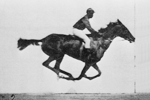
 Eadweard James Muybridge
(April 9 1830 - May 8 1904) is a British photographer that invented the zoopraxiscope, this was first shown in 1879, which was a primitive version of later motion picture devices which worked by showing a sequence of still photographs in rapid succession. Muybridge, perhaps best known today for his sequence of photographs of a race horse in motion (which proved for the first time that at top speed all feet leave the ground), studied photography in the early 1860s with daguerrotypist Silas Selleck and later achieved recognition for his photographs of the Yosemite Valley and other scenes of the American Far West. The zoopraxiscope emerged out of his studies of motion as shown in sequences of still photographs. His 11-volume work, Animal Locomotion , published in 1887, contained over 100,000 photographs. In 1893, he lectured at Zoopraxigraphical Hall at the World's Columbian Exposition in Chicago..
The Zoopraxiscope


 Saul Bass (May 1920 to April 25 1996) was an American graphic designer and acasemy award winning filmaker, but is best known for his design on animated motion picture title sequence. During his peak time of his career he has collabrated with Alfred Hitchcock, Otto Preminger and Martin Scrosese. In the 80's and 90's it seems as though every movie and TV programme had the title sequence of the saul Bass's influences like Tom and jerry has its lion roaring at the start and then appears to have a mysterious music title sequence, James bond with its silhouette of Bond and the stylish women and even Pink panther with its well known recognise instrumental playing in the background. I wouldn’t be surprise if Saul Bass himself designed it, as he was the prime time king of the contemporise animated digital media.
The title sequence he has worked on are:
Carmen Jones (1954)
The Man with the Golden Arm (1955)
The Seven Year Itch (1955)
Around the World in Eighty Days (1956)
Bonjour Tristesse (1958)
Vertigo (1958)
Anatomy of a Murder (1958)
The Big Country (1958)
North by Northwest (1959)
Psycho (1960)
Spartacus (1960)
Exodus (1960)
Advise and Consent (1960)
Ocean's Eleven (1960)
West Side Story (1961)
Walk on the Wild Side (1962)
The Victors (1963)
Nine Hours to Rama (1963)
It's a Mad, Mad, Mad, Mad World (1963)
The Cardinal (1963)
In Harm's Way (1965)
Bunny Lake Is Missing (1965)
Grand Prix (1966)
Seconds (1966)
Broadcast News (1987)
Big (1988)
The War of the Roses (1989)
Goodfellas (1990)
Cape Fear (1991)
Doc Hollywood (1991)
Age of Innocence (1993)
Casino (1995)
Ocean's Eleven title sequence
Saul Bass poster design of the film Vertigo

 Jan Švankmajer (born 4 September 1934 in Prague) is a Czech surrealist artist. His work spans several media. He is known for his surreal animations and features, which have greatly influenced other artists such as Tim Burton, Terry Gilliam, The Brothers Quay and many others.
Contents. Jan Svankmajer is an inspiration to me, pioneering through the digital world since his known for his intriguing animation I have followed this person for a while now and in my opinion the strongest point he specialises must be the clay/surreal animation. Often he experiments several medias in his animation and the creativity inside his mind are extremes, he should really be classed as a surrealist filmmaker as his work moves effortlessly between animation and live action. The pace and rhythm of the editing is superb and his work is a must for those who are into something a little bit darker or
political.
This piece is a great introduction to his work, Dimensions of Dialogue. On top is part 1, and below part 2.
“The world is divided into 2 unequal camps - those who have never heard of Jan Svankmajer and those who happen upon his work and know that they have come face to face with genius” The New Yorker
posted by Simon Genesis @ 05:31,
,
![]()
__________________________________________________
Task TWO
John Lewis Department Store
Wayfinding
 The John Lewis Partnership is a major United Kingdom department store, Waitrose supermarket and the direct services company Greenbee. The company is the 3rd largest UK private company in the Sunday Times Top Track 100 for 2008. The chain's image is upmarket, and it appeals strongly to a middle class core of shoppers. Recently however John Lewis have been marketing towards all types of buyers, with the introduction of their Simply range, and the expansion of the business.
 John Lewis has a clear and simple wayfinding system, picking up there guidance leaflet was something i would normally expect of its simplicity and the usefulness for there customers to get around with. At the starting point of the escalators i found that there was always a information point board plus a staff with a ribbon around the body giving help and directions with the customers on where the products, sections and department are situated (as shown through the images)


Guiding map


Individual floor plan, as you can see on the guiding map is designed as a floor plan the layout shows each floor has its own folded pages and the grounds are clearly stated with its own sections. This will make it easier for customers to know where they must head for a particular department they want.\
posted by Simon Genesis @ 14:55,
,
![]()
The Authors

About This Blog
This blog discusses the current visual, social and technological debates in design. Albert Einstein said, “The secret to creativity is knowing how to hide your sources,” but what the hell did he know anyway?